#Importing Libreries
import pandas as pd
import numpy as np
import seaborn as sns
import matplotlib.pyplot as plt
import plotly.express as px
import plotly.graph_objects as go

#ignore warnings
import warnings
warnings.filterwarnings('ignore')CAR SALES REPORT
This Dataset contain data from Global Car Sales of each brand in market
Goals for this Project:
- Market Analysis: Evaluate overall trends and regional variations in car Sales to assess manufacturrer Performance, model preferences and demographic insights.
- Forecasting and Predictive Analysis: Use historical Data for forecasting and predict future market trends. Support marketing, advertising, and investment decisions based on insights.
Table of Contents:
- IMPORT LIBRARIES
- LOAD THE DATASET
- EXPLORATORY DATA ANALYSIS (EDA)
- PREDICTIVE MODEL
Step 1| Import Libraries
Step 2| Load Dataset
#Loading Dataset
df = pd.read_csv('Car Sales.xlsx - car_data.csv')

#Show first 5 rows
df.head()| Car_id | Date | Customer Name | Gender | Annual Income | Dealer_Name | Company | Model | Engine | Transmission | Color | Price ($) | Dealer_No | Body Style | Phone | Dealer_Region | |
|---|---|---|---|---|---|---|---|---|---|---|---|---|---|---|---|---|
| 0 | C_CND_000001 | 1/2/2022 | Geraldine | Male | 13500 | Buddy Storbeck's Diesel Service Inc | Ford | Expedition | Double Overhead Camshaft | Auto | Black | 26000 | 06457-3834 | SUV | 8264678 | Middletown |
| 1 | C_CND_000002 | 1/2/2022 | Gia | Male | 1480000 | C & M Motors Inc | Dodge | Durango | Double Overhead Camshaft | Auto | Black | 19000 | 60504-7114 | SUV | 6848189 | Aurora |
| 2 | C_CND_000003 | 1/2/2022 | Gianna | Male | 1035000 | Capitol KIA | Cadillac | Eldorado | Overhead Camshaft | Manual | Red | 31500 | 38701-8047 | Passenger | 7298798 | Greenville |
| 3 | C_CND_000004 | 1/2/2022 | Giselle | Male | 13500 | Chrysler of Tri-Cities | Toyota | Celica | Overhead Camshaft | Manual | Pale White | 14000 | 99301-3882 | SUV | 6257557 | Pasco |
| 4 | C_CND_000005 | 1/2/2022 | Grace | Male | 1465000 | Chrysler Plymouth | Acura | TL | Double Overhead Camshaft | Auto | Red | 24500 | 53546-9427 | Hatchback | 7081483 | Janesville |
#Lets check unique values present in this data
df.nunique()
Car_id 23906
Date 612
Customer Name 3022
Gender 2
Annual Income 2508
Dealer_Name 28
Company 30
Model 154
Engine 2
Transmission 2
Color 3
Price ($) 870
Dealer_No 7
Body Style 5
Phone 23804
Dealer_Region 7
dtype: int64Observatios: * There are 3022 unique customers and 28 dealers in 7 different regions. * Also, there are 154 models of car available in 5 different body style, 2 different trasmissin type and in 3 different colours.
Step 3| Exploratory Data Analysis (EDA)
Step 3.1| Data Structure
#Lets check dataset structure
df.info()
<class 'pandas.core.frame.DataFrame'>
RangeIndex: 23906 entries, 0 to 23905
Data columns (total 16 columns):
# Column Non-Null Count Dtype
--- ------ -------------- -----
0 Car_id 23906 non-null object
1 Date 23906 non-null object
2 Customer Name 23906 non-null object
3 Gender 23906 non-null object
4 Annual Income 23906 non-null int64
5 Dealer_Name 23906 non-null object
6 Company 23906 non-null object
7 Model 23906 non-null object
8 Engine 23906 non-null object
9 Transmission 23906 non-null object
10 Color 23906 non-null object
11 Price ($) 23906 non-null int64
12 Dealer_No 23906 non-null object
13 Body Style 23906 non-null object
14 Phone 23906 non-null int64
15 Dealer_Region 23906 non-null object
dtypes: int64(3), object(13)
memory usage: 2.9+ MBObsevations: > * Most Columns have object datatype
df.describe()| Annual Income | Price ($) | Phone | |
|---|---|---|---|
| count | 2.390600e+04 | 23906.000000 | 2.390600e+04 |
| mean | 8.308403e+05 | 28090.247846 | 7.497741e+06 |
| std | 7.200064e+05 | 14788.687608 | 8.674920e+05 |
| min | 1.008000e+04 | 1200.000000 | 6.000101e+06 |
| 25% | 3.860000e+05 | 18001.000000 | 6.746495e+06 |
| 50% | 7.350000e+05 | 23000.000000 | 7.496198e+06 |
| 75% | 1.175750e+06 | 34000.000000 | 8.248146e+06 |
| max | 1.120000e+07 | 85800.000000 | 8.999579e+06 |
Step 3.2| Shape
df.shape(23906, 16)df.columnsIndex(['Car_id', 'Date', 'Customer Name', 'Gender', 'Annual Income',
'Dealer_Name', 'Company', 'Model', 'Engine', 'Transmission', 'Color',
'Price ($)', 'Dealer_No ', 'Body Style', 'Phone', 'Dealer_Region'],
dtype='object')Step 3.3| Missing Values
df.isnull().sum().sort_values(ascending=False)Car_id 0
Date 0
Customer Name 0
Gender 0
Annual Income 0
Dealer_Name 0
Company 0
Model 0
Engine 0
Transmission 0
Color 0
Price ($) 0
Dealer_No 0
Body Style 0
Phone 0
Dealer_Region 0
dtype: int64Inference: There isn’t missing values present in the Dataset
Step 3.4| Data Analysis
Step 3.4.1| Customers
#Lets check the distribution of male and female in this dataset:
fig = px.bar(df, x=df['Gender'].unique(), y=df['Gender'].value_counts(),
            title='Gender wise Analysis', width=600, height=400,
            text=df['Gender'].value_counts(), color=df['Gender'].value_counts(),
            color_continuous_scale='Sunsetdark', labels={"x":"Gender", "y":"Count"})

fig.show()
Unable to display output for mime type(s): application/vnd.plotly.v1+jsonIncome Analysis Classification of incomes in Categories
#Lets create the intervals for the categories
bins = np.linspace(min(df["Annual Income"]), max(df["Annual Income"]), 6)

bins
array([1.008000e+04, 2.248064e+06, 4.486048e+06, 6.724032e+06,
8.962016e+06, 1.120000e+07])# Lets create the group names for each category
group_names = ["Low", "Lower Middle", "Middle", "Upper Middle", "High"]
#Lets Classificate the incomes in each Category
df["Annual Income (binned)"] = pd.cut(df["Annual Income"], bins, labels = group_names, include_lowest=True)
df[["Annual Income", "Annual Income (binned)"]]| Annual Income | Annual Income (binned) | |
|---|---|---|
| 0 | 13500 | Low |
| 1 | 1480000 | Low |
| 2 | 1035000 | Low |
| 3 | 13500 | Low |
| 4 | 1465000 | Low |
| ... | ... | ... |
| 23901 | 13500 | Low |
| 23902 | 900000 | Low |
| 23903 | 705000 | Low |
| 23904 | 13500 | Low |
| 23905 | 1225000 | Low |
23906 rows × 2 columns
#Lets check the distribution of sales for each Company
fig = px.bar(df, x=df['Annual Income (binned)'].unique(), y=df['Annual Income (binned)'].value_counts(),
            title='Annual Income (binned) wise Analysis', width=600, height=400,
            text=df['Annual Income (binned)'].value_counts(), color=df['Annual Income (binned)'].value_counts(),
            color_continuous_scale='Sunsetdark', labels={"x":"Annual Income (binned)", "y":"Count"})
fig.show()
Unable to display output for mime type(s): application/vnd.plotly.v1+jsonOutliers
#Lets check the outliers
fig = px.box(df, y='Annual Income', title="Outliers Analysis",
             width=600, height=400)

fig.show()
Unable to display output for mime type(s): application/vnd.plotly.v1+jsonfig = px.histogram(df, x=df["Annual Income"], nbins=70,
width=600, height=400)
fig.show()Unable to display output for mime type(s): application/vnd.plotly.v1+jsonObservations: > * Mayority of customers have annual income between 10k to 2.4Mn
Step 3.4.2| Company Analysis
Dealers
df['Dealer_Region'].value_counts()Austin 4135
Janesville 3821
Scottsdale 3433
Pasco 3131
Aurora 3130
Middletown 3128
Greenville 3128
Name: Dealer_Region, dtype: int64fig = px.bar(df, x=df['Dealer_Region'].unique(), y=df['Dealer_Region'].value_counts(),
title='Dealer Region wise Analysis', width=600, height=400,
text=df['Dealer_Region'].value_counts(), color=df['Dealer_Region'].value_counts(),
color_continuous_scale='Sunsetdark', labels={"x":"Dealer_Region", "y":"Count"})
fig.show()Unable to display output for mime type(s): application/vnd.plotly.v1+jsondf['Dealer_Name'].value_counts()Progressive Shippers Cooperative Association No 1318
Rabun Used Car Sales 1313
Race Car Help 1253
Saab-Belle Dodge 1251
Star Enterprises Inc 1249
Tri-State Mack Inc 1249
Ryder Truck Rental and Leasing 1248
U-Haul CO 1247
Scrivener Performance Engineering 1246
Suburban Ford 1243
Nebo Chevrolet 633
Pars Auto Sales 630
New Castle Ford Lincoln Mercury 629
McKinney Dodge Chrysler Jeep 629
Hatfield Volkswagen 629
Gartner Buick Hyundai Saab 628
Pitre Buick-Pontiac-Gmc of Scottsdale 628
Capitol KIA 628
Clay Johnson Auto Sales 627
Iceberg Rentals 627
Buddy Storbeck's Diesel Service Inc 627
Motor Vehicle Branch Office 626
Chrysler of Tri-Cities 626
C & M Motors Inc 625
Enterprise Rent A Car 625
Chrysler Plymouth 625
Diehl Motor CO Inc 624
Classic Chevy 623
Name: Dealer_Name, dtype: int64Company
df['Company'].value_counts()Chevrolet 1819
Dodge 1671
Ford 1614
Volkswagen 1333
Mercedes-B 1285
Mitsubishi 1277
Chrysler 1120
Oldsmobile 1111
Toyota 1110
Nissan 886
Mercury 874
Lexus 802
Pontiac 796
BMW 790
Volvo 789
Honda 708
Acura 689
Cadillac 652
Plymouth 617
Saturn 586
Lincoln 492
Audi 468
Buick 439
Subaru 405
Jeep 363
Porsche 361
Hyundai 264
Saab 210
Infiniti 195
Jaguar 180
Name: Company, dtype: int64#Lets see the distribution of sales for each Company
company_total_sales = df.groupby(["Company"]).size().sort_values(ascending=False).reset_index()
company_total_sales.rename(columns={0:"Company Sales"}, inplace=True)
fig = px.bar(df, x=df['Company'].unique(), y=df['Company'].value_counts(),
title='Company wise Analysis', width=600, height=400,
text=df['Company'].value_counts(), color=df['Company'].value_counts(),
color_continuous_scale='Sunsetdark', labels={"x":"Company", "y":"Count"})
fig.show()Unable to display output for mime type(s): application/vnd.plotly.v1+jsonStep 3.4.3| Product Analysis (Cars, Models, Body style, …)
fig = px.bar(df, x=df['Body Style'].unique(), y=df['Body Style'].value_counts(),
            title='Body Style wise Analysis', width=600, height=400,
            text=df['Body Style'].value_counts(), color=df['Body Style'].value_counts(),
            color_continuous_scale='Sunsetdark', labels={"x":"Body Style", "y":"Count"})

fig.show()
Unable to display output for mime type(s): application/vnd.plotly.v1+jsondf['Transmission'].value_counts()Auto 12571
Manual 11335
Name: Transmission, dtype: int64fig = px.bar(df, x=df['Transmission'].unique(), y=df['Transmission'].value_counts(),
title='Transmission wise Analysis', width=600, height=400,
text=df['Transmission'].value_counts(), color=df['Transmission'].value_counts(),
color_continuous_scale='Sunsetdark', labels={"x":"Company", "y":"Count"})
fig.show()Unable to display output for mime type(s): application/vnd.plotly.v1+jsondf['Model'].value_counts()Diamante 418
Silhouette 411
Prizm 411
Passat 391
Ram Pickup 383
...
Mirage 19
Alero 18
RX300 15
Avalon 15
Sebring Conv. 10
Name: Model, Length: 154, dtype: int64#lets check the top 10 Models
top_10_models = df['Model'].value_counts().nlargest(10)
fig = px.bar(top_10_models, x=top_10_models.index, y=top_10_models.values,
title='Top 10 Models wise Analysis', width=600, height=400,
text=top_10_models.values, color=top_10_models.values,
color_continuous_scale='Sunsetdark', labels={"x":"Model", "y":"Count"})
fig.show()Unable to display output for mime type(s): application/vnd.plotly.v1+jsonStep 3.4.4| Sales Analysis
df['Price ($)'].describe()count 23906.000000
mean 28090.247846
std 14788.687608
min 1200.000000
25% 18001.000000
50% 23000.000000
75% 34000.000000
max 85800.000000
Name: Price ($), dtype: float64print('The Mode of Price ($) is:', df['Price ($)'].mode()[0])
print('The Mean of Price ($) is:', df['Price ($)'].mean())
print('The Median of Price ($) is:', df['Price ($)'].median())The Mode of Price ($) is: 22000
The Mean of Price ($) is: 28090.247845729107
The Median of Price ($) is: 23000.0#Lets create the intervals for the categories
bins_price = np.linspace(min(df["Price ($)"]), max(df["Price ($)"]), 6)
binsarray([1.008000e+04, 2.248064e+06, 4.486048e+06, 6.724032e+06,
8.962016e+06, 1.120000e+07])# Lets create the group names for each category
group_names = ["Low", "Lower Middle", "Middle", "Upper Middle", "High"]
df_prices = df[['Price ($)']]
#Lets Classificate the incomes in each Category
df_prices["Price (binned)"] = pd.cut(df_prices["Price ($)"], bins_price, labels = group_names, include_lowest=True)
df_prices
| Price ($) | Price (binned) | |
|---|---|---|
| 0 | 26000 | Lower Middle |
| 1 | 19000 | Lower Middle |
| 2 | 31500 | Lower Middle |
| 3 | 14000 | Low |
| 4 | 24500 | Lower Middle |
| ... | ... | ... |
| 23901 | 12000 | Low |
| 23902 | 16000 | Low |
| 23903 | 21000 | Lower Middle |
| 23904 | 31000 | Lower Middle |
| 23905 | 27500 | Lower Middle |
23906 rows × 2 columns
#Lets check the distribution of sales for each Company
fig = px.bar(df_prices, x=df_prices['Price (binned)'].unique(), y=df_prices['Price (binned)'].value_counts(),
            title='Price (binned) wise Analysis', width=600, height=400,
            text=df_prices['Price (binned)'].value_counts(), color=df_prices['Price (binned)'].value_counts(),
            color_continuous_scale='Sunsetdark', labels={"x":"Price (binned)", "y":"Count"})
fig.show()
Unable to display output for mime type(s): application/vnd.plotly.v1+jsonfig = px.histogram(df, x=df_prices["Price ($)"], nbins=70,
width=600, height=400)
fig.show()Unable to display output for mime type(s): application/vnd.plotly.v1+json#Lets check correlation between Company and average price they are selling at
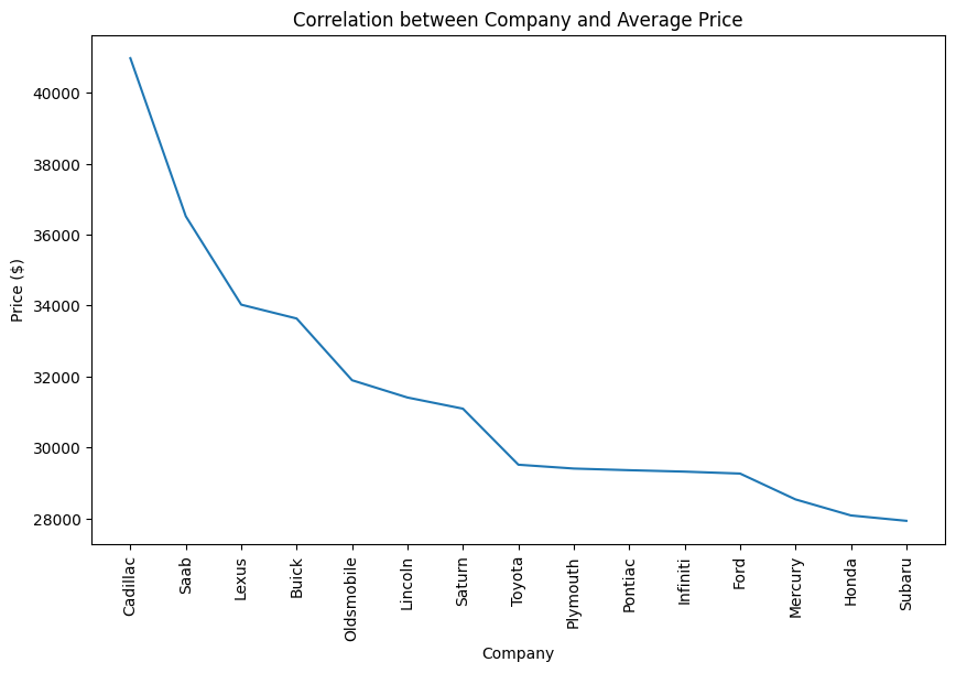
company_avg = df.groupby(['Company'])['Price ($)'].mean().sort_values(ascending=False).head(15).reset_index()
plt.figure(figsize=(10, 6))
sns.lineplot(x='Company', y='Price ($)', data=company_avg)
plt.xticks(rotation=90)
plt.title('Correlation between Company and Average Price') # Título del gráfico
plt.show()
# Lets check the relation between Price and Transmission
fig = px.scatter(df, x='Price ($)', y='Transmission', color='Price ($)',
                 title='Price & Transmission Analysis',  width=600, height=400,
                 color_continuous_scale='Sunsetdark')

# Muestra la figura
fig.show()
Unable to display output for mime type(s): application/vnd.plotly.v1+jsonsns.kdeplot(data=df,x='Price ($)',hue='Body Style')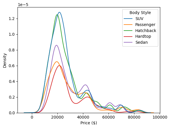
fig = px.box(df, y='Company', x='Price ($)', color='Company',
             width=600, height=400,
             title='Distribution of Price and Compay')

fig.show()
Unable to display output for mime type(s): application/vnd.plotly.v1+jsondf_no_phone = df.drop(columns='Phone')
sns.heatmap(df_no_phone.corr(numeric_only=True),annot=True)
plt.show()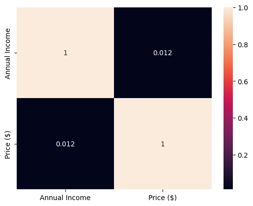
Observations: * Automatic and manual cars have similar prices, but some automatic cars have a wider upper price range than manual cars. * The correlation of 0.012 between price and annual income suggests a very weak positive relationship. * The majority of sales are from cars priced between $12,000 and $34,000, with SUVs, hatchbacks, and sedans being the most sold body styles within this range.
Step 4| Predictive Model
Step 4.1| Dummies Variables
from sklearn.preprocessing import LabelEncoder


le = LabelEncoder()

col_list = ['Gender', 'Model', 'Dealer_Name', 'Company', 'Engine', 'Transmission', 'Color', 'Body Style', 'Dealer_Region']

for colsn in col_list:
    df[colsn] = le.fit_transform(df[colsn].astype(str))

df.head()| Car_id | Date | Customer Name | Gender | Annual Income | Dealer_Name | Company | Model | Engine | Transmission | Color | Price ($) | Dealer_No | Body Style | Phone | Dealer_Region | Annual Income (binned) | |
|---|---|---|---|---|---|---|---|---|---|---|---|---|---|---|---|---|---|
| 0 | C_CND_000001 | 1/2/2022 | Geraldine | 1 | 13500 | 0 | 8 | 60 | 0 | 0 | 0 | 26000 | 06457-3834 | 3 | 8264678 | 4 | Low |
| 1 | C_CND_000002 | 1/2/2022 | Gia | 1 | 1480000 | 1 | 7 | 52 | 0 | 0 | 0 | 19000 | 60504-7114 | 3 | 6848189 | 0 | Low |
| 2 | C_CND_000003 | 1/2/2022 | Gianna | 1 | 1035000 | 2 | 4 | 57 | 1 | 1 | 2 | 31500 | 38701-8047 | 2 | 7298798 | 2 | Low |
| 3 | C_CND_000004 | 1/2/2022 | Giselle | 1 | 13500 | 4 | 27 | 36 | 1 | 1 | 1 | 14000 | 99301-3882 | 3 | 6257557 | 5 | Low |
| 4 | C_CND_000005 | 1/2/2022 | Grace | 1 | 1465000 | 3 | 0 | 141 | 0 | 0 | 2 | 24500 | 53546-9427 | 1 | 7081483 | 3 | Low |
Step 4.2 Dates
df[['month', 'day', 'year']] = df['Date'].str.split('/', n=2, expand=True)

df.head()| Car_id | Date | Customer Name | Gender | Annual Income | Dealer_Name | Company | Model | Engine | Transmission | Color | Price ($) | Dealer_No | Body Style | Phone | Dealer_Region | Annual Income (binned) | month | day | year | |
|---|---|---|---|---|---|---|---|---|---|---|---|---|---|---|---|---|---|---|---|---|
| 0 | C_CND_000001 | 1/2/2022 | Geraldine | 1 | 13500 | 0 | 8 | 60 | 0 | 0 | 0 | 26000 | 06457-3834 | 3 | 8264678 | 4 | Low | 1 | 2 | 2022 |
| 1 | C_CND_000002 | 1/2/2022 | Gia | 1 | 1480000 | 1 | 7 | 52 | 0 | 0 | 0 | 19000 | 60504-7114 | 3 | 6848189 | 0 | Low | 1 | 2 | 2022 |
| 2 | C_CND_000003 | 1/2/2022 | Gianna | 1 | 1035000 | 2 | 4 | 57 | 1 | 1 | 2 | 31500 | 38701-8047 | 2 | 7298798 | 2 | Low | 1 | 2 | 2022 |
| 3 | C_CND_000004 | 1/2/2022 | Giselle | 1 | 13500 | 4 | 27 | 36 | 1 | 1 | 1 | 14000 | 99301-3882 | 3 | 6257557 | 5 | Low | 1 | 2 | 2022 |
| 4 | C_CND_000005 | 1/2/2022 | Grace | 1 | 1465000 | 3 | 0 | 141 | 0 | 0 | 2 | 24500 | 53546-9427 | 1 | 7081483 | 3 | Low | 1 | 2 | 2022 |
Step 4.3 Model
from sklearn.ensemble import RandomForestRegressor
from sklearn.model_selection import train_test_split

model_df = df[['Gender', 'Model', 'Annual Income', 'Dealer_Name', 'Company', 'Engine', 'Transmission', 'Color', 'Body Style', 'Dealer_Region', 'month', 'day', 'year', 'Price ($)']]

#Variables definition
x = model_df[['Gender', 'Model', 'Engine', 'Transmission', 'Company', 'Color', 'Body Style', 'Dealer_Region']]
y = model_df[['Price ($)']]

#Train
x_train, x_test, y_train, y_test = train_test_split(x,y, test_size=0.25, random_state=2203)

#Test
rf_tree = RandomForestRegressor(n_estimators=100)
rf_tree = rf_tree.fit(x_train, y_train)

score = rf_tree.score(x_test, y_test)

print("RandomForestRegressor r2 score is:", str(score))
RandomForestRegressor r2 score is: 0.6215918313822122